Portfolio · NotesWhat we changed in Cian’s mortgage application
What we changed in the mortgage application and why.
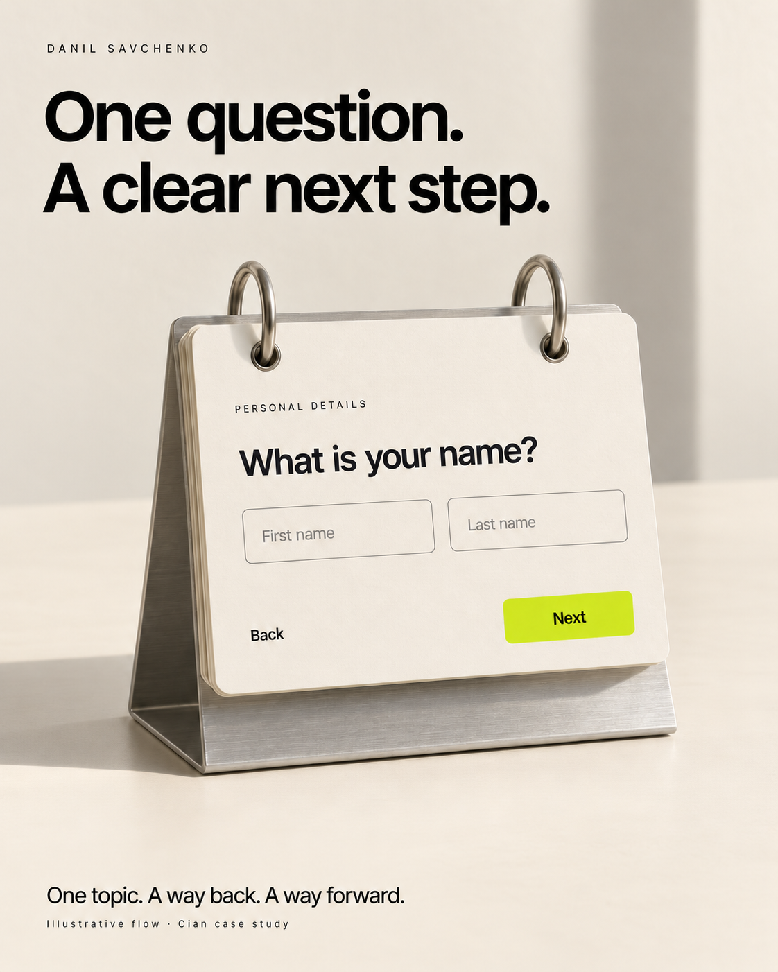
At Cian, research on the mortgage application showed that people were anxious about applying and making a mistake. That mattered to how I redesigned the form.
I split it into small steps, with one topic on each screen. Fields that belonged together stayed together. We added short explanations of how to answer and kept Back and Next visible, so people could move through the application and correct their answers.
I started at 320px wide, and we used a shared web implementation through a webview. We had to make the flow practical to build as well as easier to get through.
With product and engineering, we launched the replacement in four months. In the first month, it produced ten times as many completed applications as the previous version, with traffic unchanged. That's the before-and-after result for the completed form, not a measure of what any single screen contributed.
Explore the Cian case